A Machine Learning Based Approach to Behavioral Customer Segmentation

Apple founder Steve Jobs once famously said, “Get closer than ever to your customer. So close, in fact, that you tell them what they need well before they realize it themselves.” At Bounteous, we are working with our clients to help them get closer than ever to their customers. And how are we doing this? In a recent blog post, we presented a demographic based approach to customer segmentation. In this post, we present a behavior based approach, based on customer purchase patterns. Different types of customer segmentations allow us to act on our findings in different ways. Whereas a demographic customer segmentation might drive changes in marketing at different geographic levels (e.g. marketing spends and messaging across DMAs or micro-targeted changes in different ZIP Codes), a behavioral segmentation allows us to customize our marketing approach at a much more personal 1:1 level with our consumers (e.g. personalized emails or paid media retargeting using their unique customer identifier).
Customer purchase behavior can be quantified in many different ways. A common approach is to hone in on a customer’s purchase patterns. When did your customers last purchase? How frequently are your customers purchasing? How much are your customers purchasing? These three questions are the pillars of what’s referred to as Recency, Frequency, Monetary (RFM) analysis.
A standard approach to RFM analysis would be to calculate these three values over some set period of time (for example, how recently someone purchased, how many purchases they made, and how much they spent over the past year), and then slice and dice your customers into different segments based on their RFM values relative to the entire customer base.
RFM analysis can be performed on any type of transaction data, as long as it includes a customer identifier, transaction date, and transaction amount. This data can come from many places, including directly from order data or even from your web tracking. Imagine analyzing your GA data in Google BigQuery and ingesting your resulting customer segments back into GA as a custom dimension. From here, native integrations allow you to send audiences into Google Marketing Platform for activation. At Bounteous, we are always working to provide our clients with innovative approaches to these types of analysis. By harnessing machine learning techniques, our data science team is able to expand on this to incorporate more data as we aim to uncover additional insights about our clients’ customers.
Recency, Frequency, Monetary (RFM) Analysis
Using the Kaggle Transactions Data dataset, we present an example of a machine learning based approach that resulted in identifying 5 different customer segments and has the ability to be easily converted into a productionized model that tracks customer segments on a recurring basis.To conduct this analysis, we begin only with customer purchase history.
| Customer ID | Transaction Date | Transaction Amount ($) |
|---|---|---|
| CS5295 | 11-Feb-13 | 35 |
| CS4768 | 15-Mar-15 | 39 |
| CS2122 | 26-Feb-13 | 52 |
| CS1217 | 16-Nov-11 | 99 |
| CS1850 | 20-Nov-13 | 78 |
There are many useful features from a dataset like this that Bounteous’ Data Science team can extract for an RFM analysis. Before doing so, we first aggregate the dataset to a monthly level:
| Customer ID | Year Month | Monthly Spend ($) | Monthly Transactions |
|---|---|---|---|
| CS1112 | 2011-06 | 56 | 56 |
| CS1112 | 2011-07 | 0 | 0 |
| CS1112 | 2011-08 | 96 | 1 |
| CS1114 | 2011-08 | 170 | 2 |
| CS1114 | 2011-09 | 179 | 2 |
With some additional data munging, we can create additional features that tell us the following about customers CS1112 and CS1114 for any given month:
- How much did they spend in the last 1 - 12 months?
- How many transactions did they have in the last 1 - 12 months?
- How many months has it been since their last transaction?
You may now be wondering: which of these metrics should I be using to define Frequency or Monetary in my RFM analysis? Does it make more sense to look at how many purchases someone made in the last month, three months, six months, or 12 months? How correlated are frequency and monetary values for our customers? Using a technique called dimensionality reduction, we can simultaneously incorporate all of this information to answer these questions.
In this specifc analysis, we calculate the following for monetary spend and number of transactions:
- Dollars spent in current month
- Transactions in current month
- Last 3, 6, 12 months dollars spent
- Last 3, 6, 12 months transactions
We are also able to extract other insights from our dataset that may be useful for segmenting customers, including:
- Lifetime of customer (months since first purchase)
- Months since most recent purchase
- Lifetime spend
- Lifetime transactions
Our analysis only looks at customers as of the last year-month combination to simulate “present day”, and we only look at customers who have made a transaction in the last 12 months.
Principal Component Analysis (PCA) is our dimensionality reduction method of choice; through PCA, we can “squeeze down” the insights from these different values to a reduced number of dimensions (and data) to work with. As an analogy, think of a Principal Component Analysis index as a metric similar to a credit score. Credit scores are made up of many different things: Did you pay your mortgage on time? Do you make your car payments on time? How much debt do you have? All of these things affect your credit score, and people who have similar answers to these questions tend to have similar scores. In other words, your credit score is correlated to all of these questions but not necessarily tied to one specifically
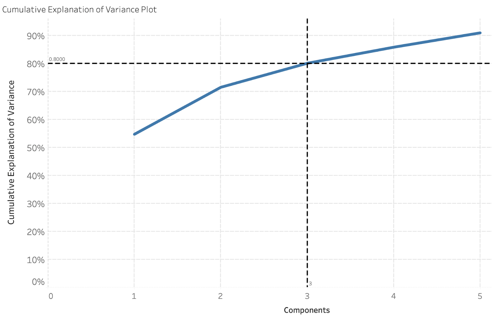
We determine the number of components we can reduce our dataset down to by using a “cumulative explanation of variance plot.” The cumulative explanation of variance plot tells us how much variance is explained in our dataset (0-100%) by the number of principal components we are reducing our dataset down to. In the visual below, we can see that for our dataset, we are able to reduce our initial dataset (12 predictors) down to only 3 components and still explain 80% of the variance!
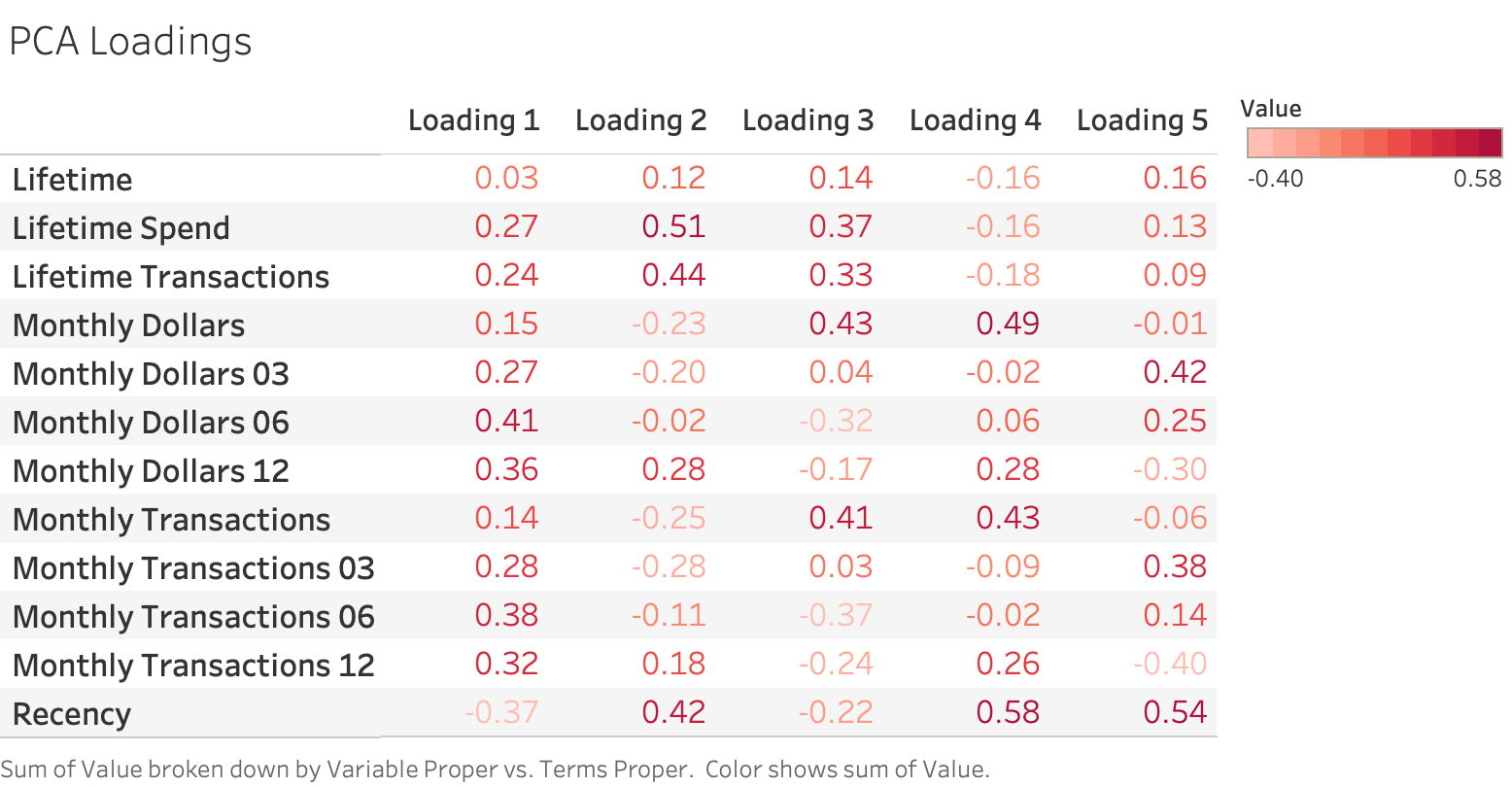
We can gain insights into our principal components by examining the loadings. In Principal Component Analysis, the loadings describe how much each variable contributes to its respective principal component. A large loading (either positive or negative) would indicate that a specific variable has a strong relationship to that principal component. The direction of a loading (+/-) indicates positive or negative correlation. For this particular analysis, the loadings for the 5 different components are described below.

From this table, we can interpret that the first principal component most heavily loads on “Monthly Dollars 06” and “Monthly Transactions 06”. These are the rolling sums of a customer’s spend and transactions over the past 6 months, respectively. Our second loading most heavily correlates with “Lifetime Spend” and “Lifetime Transactions,” and our third loading most heavily correlates with “Monthly Dollars” and “Monthly Transactions” (the values for the most recent month). Based on our PCA loadings table, we are able to determine that the three principal components we will cluster our data on are measures of a client’s shopping frequency over 6 months, their lifetime, and the most recent month.
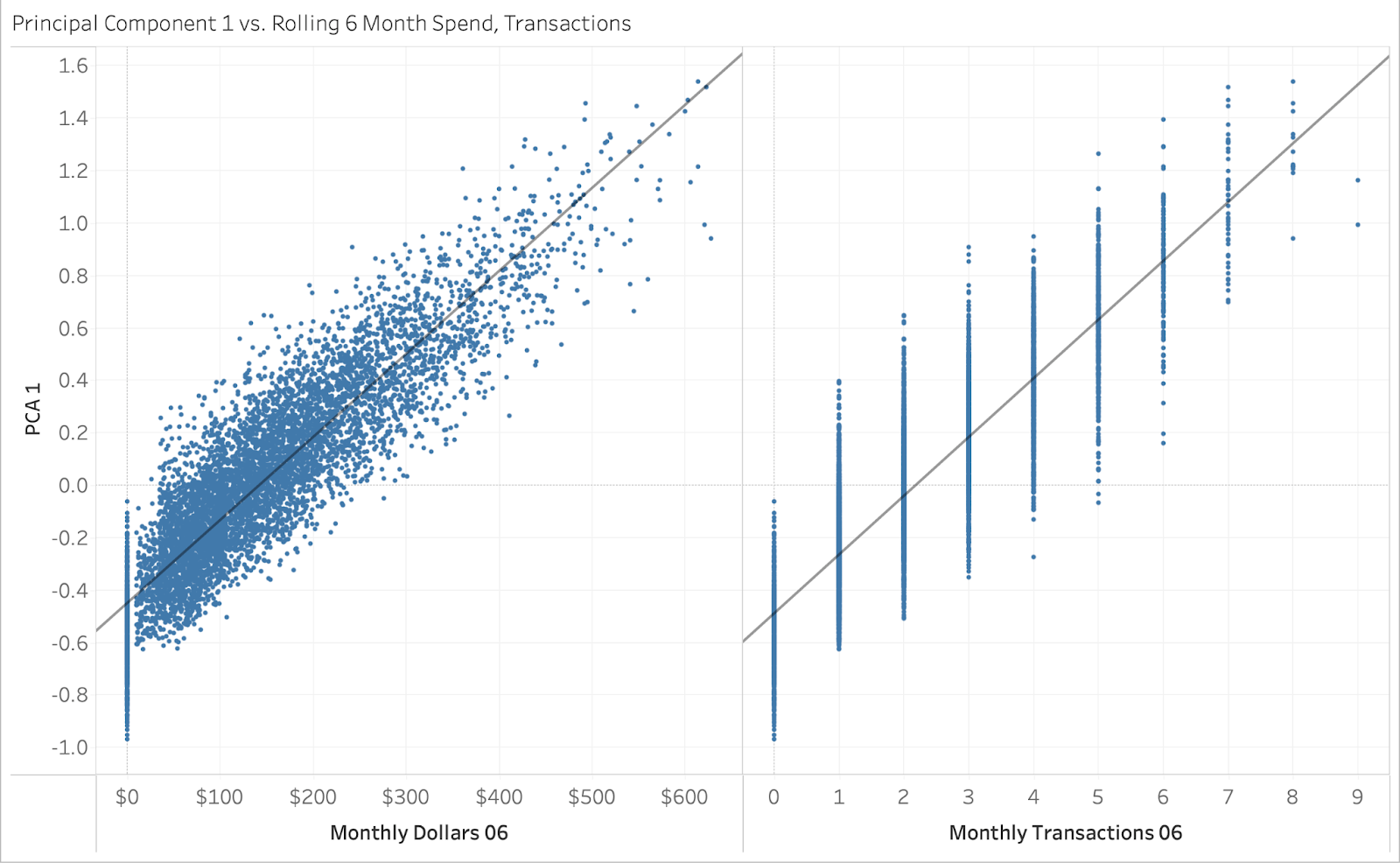
As a quality check, we can visualize the principal component scores versus the raw predictors for each of these indices. The principal component “score” is the linear combination of the loadings multiplied by the predictors’ raw values. As an example, below you can see the first principal component scores, plotted versus the two highest loading score raw values.
As we would expect, they are highly correlated. Using our 3 principal component scores, we can now cluster our customers.
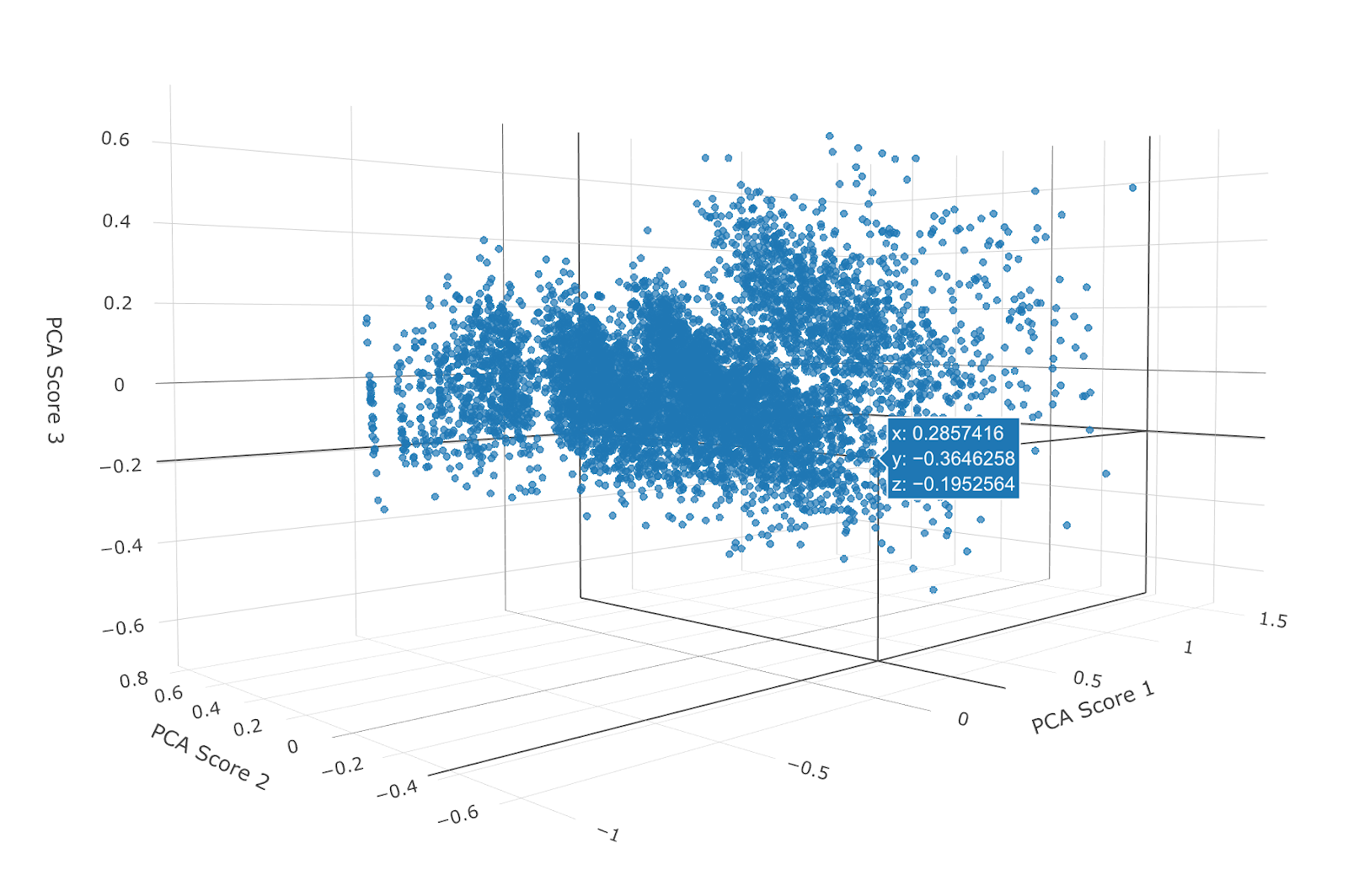
There are many different algorithms for clustering data. Clustering is an unsupervised learning technique. Unsupervised learning is a reference to the fact that we do not have an initial dataset to use where we already know what clusters some of our customers fall into. Instead, we are starting from scratch and defining our own clusters based on our customers' principal component scores. Unlike a supervised learning algorithm, which is designed to predict an already known classifier, an unsupervised learning algorithm aims to create a classifier. For this particular analysis, we will use k-Means clustering. k-Means clustering is a relatively simple concept. The idea behind it is that we are trying to cluster our data into a specified number of separate groups. Let’s imagine we are plotting our three principal component scores on an x, y, z axis (example below).
Now, we want to add k new cluster centroids to the data (k = 2 for 2 clusters, k = 5 for 5 clusters). Each of those points will try to center itself around one of the k clusters in a repeated fashion. Once this process reaches an optimal solution, our clusters are defined. There are many great references on how k-Means clustering works. If you are interested in additional details see How Does k-Means Clustering in Machine Learning Work? or A Simple Explanation of K-Means Clustering.
A natural question at this point might be how many clusters should we break our customers into? If you find yourself wondering this, don’t worry. We have an answer, and it is data driven. Anytime a k-Means clustering algorithm is run on a dataset for a given number of clusters, you can calculate something called the sum of squares within a cluster. The sum of squares is a measure of the variability of the observations within that cluster. The more tightly bound the clusters are, the lower the sum of squares. The visual below shows a comparison for the Within Cluster Sum of Squares when we specify k = 1 (one cluster) all the way out to k = 9 (nine clusters).
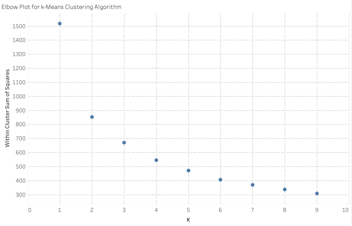
We expect as k increases, the sum of squares will decay exponentially. The more clusters you have, the more tightly bound our clusters will be! But, the trade off to this effect is that the more clusters you have, the less meaningful the exercise will be because you will have so many clusters it will be difficult to keep track of. So we need to find a trade off between the quantity of clusters and distinguishability between cluster features. We do this by looking for a point in our plot where the drop-off in sum of squares appears to significantly decrease or even out. A common analog for this is to consider the entire plot as a person’s arm in a bent position. The point of interest would be akin to a person’s elbow. This is the point at which the continuing increase in the number of clusters does not substantially decrease the Within Cluster Sum of Squares value. At this point, it is fair to say that by increasing the number of clusters, we are no longer substantially defining more similarly defined clusters. In this particular analysis, using k=5 clusters appears to be a reasonable choice.
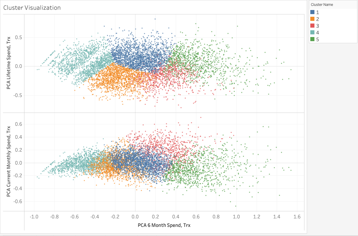
At k = 5 clusters, we can visualize the results of our 5 different clusters plotted against the three indices below.
A deeper dive into our customers can reveal additional information about their shopping habits.
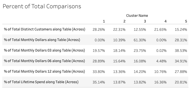
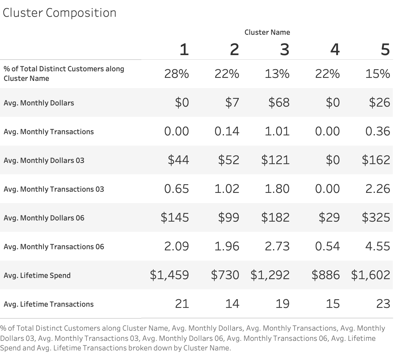
From this, we are able to gain insights into who our most valuable customers are over the course of the customers’ entire lifetime (Cluster 5), who our most recent customers are (Cluster 3), and who our lowest value customers over the course of a lifetime are (Cluster 2). An additional analysis that might be interesting would be a comparison between the percent of total customers in each cluster and the percent of total sales over the different time periods included in this analysis.
Some example insights from a table like this, might be “Cluster 1 accounts for 28.26% of our customer base, but 35.14% of our customer’s lifetime spend, whereas Cluster 2 accounts for 22.31% of our customer base but only 13.87% of our customer’s lifetime spend, Cluster 1 customers are more valuable customers over the course of their lifetime, even though they have not purchased during the current month”. Another insight might be that customers in Cluster’s 2, 3 and 5 are all customers who have purchased in the current month. While Cluster 3 customers are customers who have spent more during the current month, Cluster 5 customers have spent more over the course of their customer lifetime. Do you know what fraction of your customers or customer segments make up x% of your sales?
Activation from RFM Analysis
Depending upon your line of business, you may have customer groups who disproportionately make up a larger percentage of your sales. You may be familiar with an adage along the lines of “20% of your customers make up 80% of your sales.” While that does not hold true in our demo dataset, it is valuable for any business to know who your most valuable customers are AND how valuable they are! Are there ways you can better reach this audience? Can you deploy marketing tactics to push them from one customer group to the next? An example of this might be personalized offerings to customer segments timed with their frequency of purchase. If one customer segment makes more frequent smaller purchases and another makes less frequent larger purchases, then we can target these customer segments with offers personal to their frequency and monetary habits. A more in-depth analysis would be able to segment customers based on similarity of products purchased. An example of this might be a retail store where customer segment A has a propensity to purchase laundry detergent on a monthly basis and customer segment B has a strong propensity to make more expensive electronic device purchases on an annual basis. This type of analysis would allow you to provide personalized offers to customer segments A and B. In some instances, the customer segments can also be stored in a Customer Data Platform (CDP).
One advantage of this analysis is that it can be easily updated on a recurring monthly or quarterly basis so that you can see first-hand the effectiveness of attempts to push customers into higher valued segments. We can also automate pushing the updated segments into marketing platforms like GMP, leveraging functionality such as Google Analytics’ user data import. At Bounteous, we work with a variety of clients across many different industries. Our approach to behavior based customer segmentation by employing machine learning based analyses to hone in on differences between customers allows our clients to take a deep dive into who their customers are.